
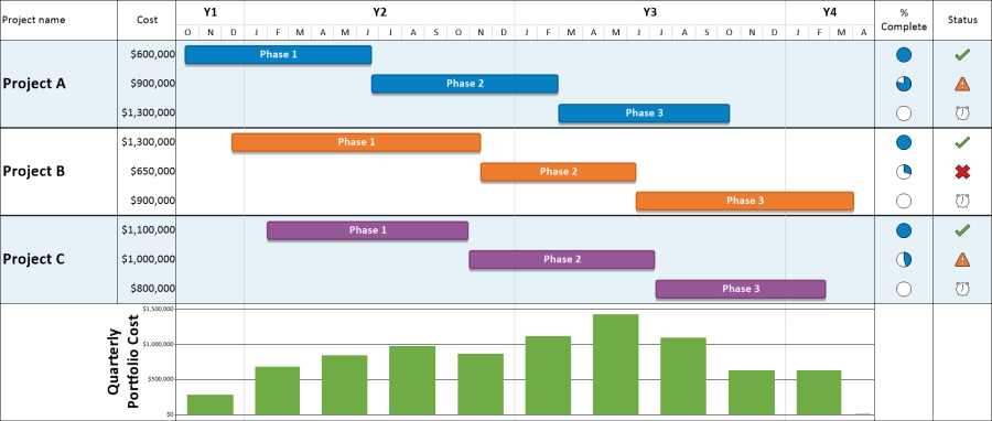
There are three key components of a good project management dashboard:
- Timeline or Gantt Chart: The project timeline or Gantt chart shows the key activities driving the overall project outcome.
- Data Columns: Dashboards that feature text columns and symbol columns provide additional details about the project's status without overwhelming the audience with too much information.
- Graphs: A dashboard isn't complete without an understanding of budget, cost, or other financial metrics. Superimposing a graph will show how these metrics change over the life of your project.
OnePager, dashboarding software for project managers, helps you build project dashboards that are much easier to understand than looking at the detailed project plan. The example in this article uses Microsoft Project, but OnePager can also build dashboards from Smartsheet, Primavera P6, Planisware, and other PPM systems.
This article will walk you through how to quickly create a project management dashboard. You can download a free trial of OnePager and follow along if you'd like.
Adding a Timeline or Gantt Chart to your Dashboard
-
Start by opening up one of your Microsoft Project files, such as the project plan example shown below. This will be the basis for your project dashboard. OnePager lets you create a filter ("Flag 20" in the picture below) so that you only show the parts of your project that are relevant to your audience.
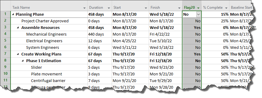
Our dashboard will summarize three projects from a portfolio. The other two projects in the portfolio have similar data to the example shown above.
-
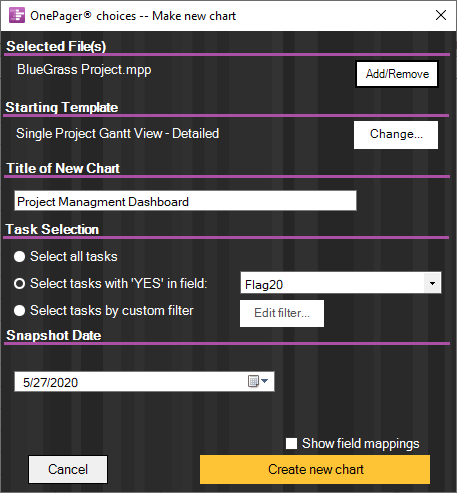
Next, double-click the OnePager icon on your desktop. From the Start screen, choose New and then select the Microsoft Project plans that you would like to include your project timeline. This will launch OnePager's easy import wizard to start building the dashboard:
-
Give your project dashboard a name and type in a status (snapshot) date for your dashboard as well. This makes it easy to make updates to your dashboard as your project plan changes later. Click the Create new chart button to build the timeline component of your dashboard:
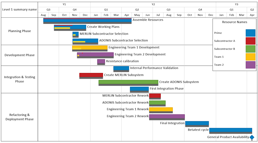
Free Trial
Adding Data Columns to your Dashboard
Now that your project dashboard has a timeline, we can add text and symbol columns to display more detailed information without overwhelming the visual. In this portfolio of projects, we want to track the following metrics:
- Cost: Display the total cost of each project's phase down to the dollar.
- Progress: Use Harvey Balls to depict the high-level progress (percent complete) of each phase.
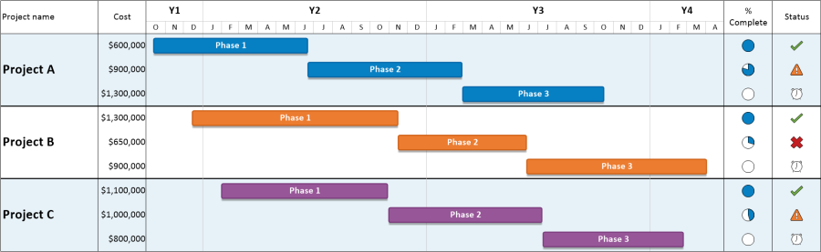
- Status: Use symbols to indicate which activities are late and which are on schedule.
We will use a text column to track cost and will use symbol columns to display progress and status information:
-
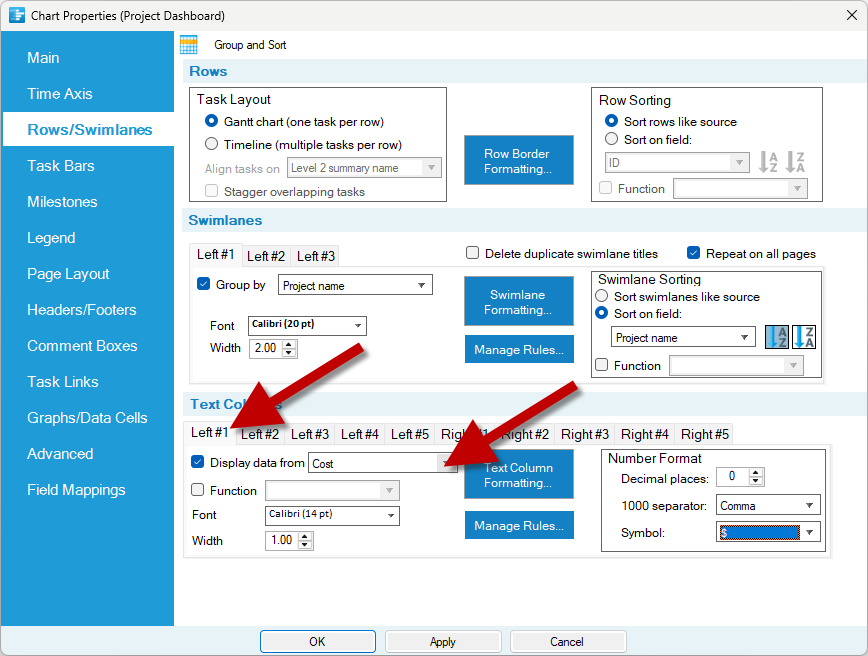
To add a text column that displays the cost for each phase, go to Home > Chart Properties > Rows/Swimlanes. Enable the Left #1 text column and point it to the Cost field from your project plan:
-
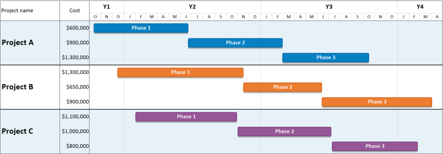
Click OK. OnePager will update your dashboard, adding a column that displays the phase-by-phase cost for each project:
-
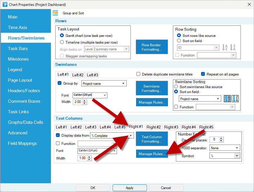
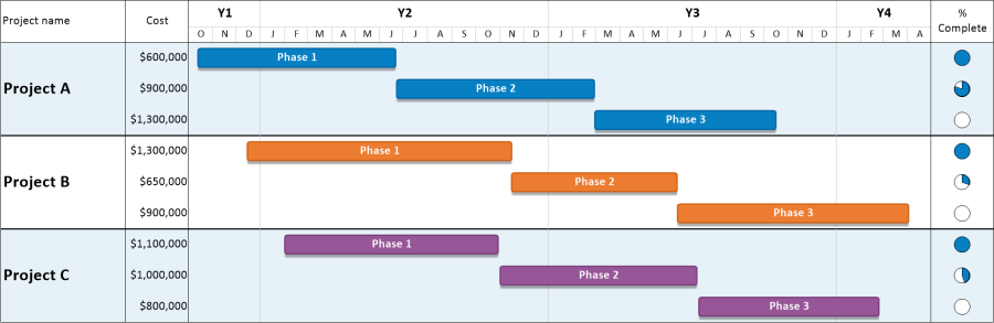
Now, let's set up a second column that displays Harvey Ball symbols based on the progress of each phase. Return to Home > Chart Properties > Rows/Swimlanes and enable the Right #1 column, mapping it to the %Complete field. To assign Harvey Balls, click the Manage Rules button:
-
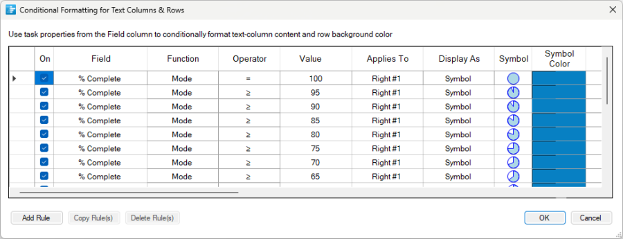
Create rules that assign Harvey Ball symbols based on the percent complete of each activity in the dashboard:
-
Click OK, and OnePager will add a symbol column to the right-hand side of the dashboard, making it easy to see how far along each phase of each project is:
-
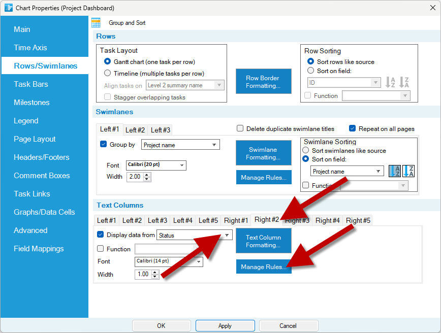
Next, let's set up a third column that displays symbols based on the status of each phase. Return to Home > Chart Properties > Rows/Swimlanes one more time and enable the Right #2 column, mapping it to the Status field. To assign symbols, click the Manage Rules button:
-
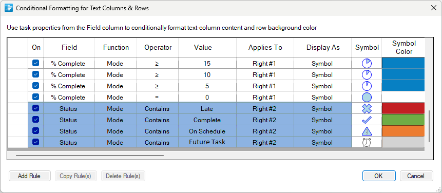
Create rules that assign symbols based on the status of each phase shown in the dashboard:
-
Click OK, and OnePager will add a second symbol column to the right-hand side of the dashboard, making it easy to see the status of each phase:
Free Trial
Adding a Financial Graph to your Project Dashboard
Our dashboard now contains a timeline and data columns. The final step is to add a graph that tracks project finances over time:
-
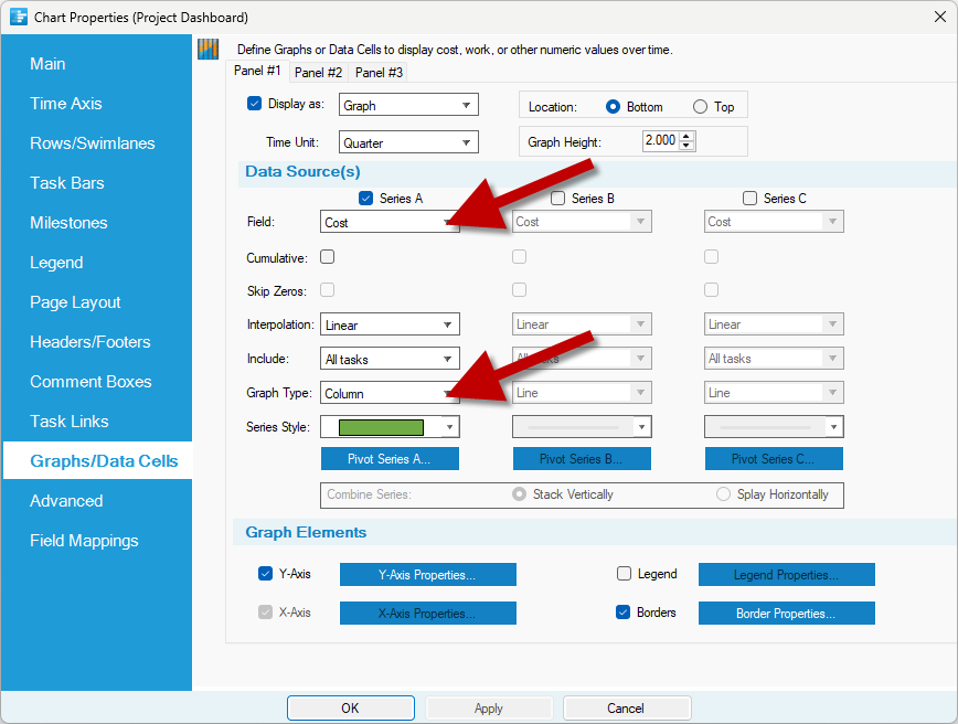
To add a graph that shows project cost over time, go to Home > Chart Properties > Graphs/Data Cells. Map the graph to the Cost field and change its Graph Type to a Column graph:
-
Click OK, and OnePager will update the project dashboard to include a column graph of the total portfolio cost over time:
-
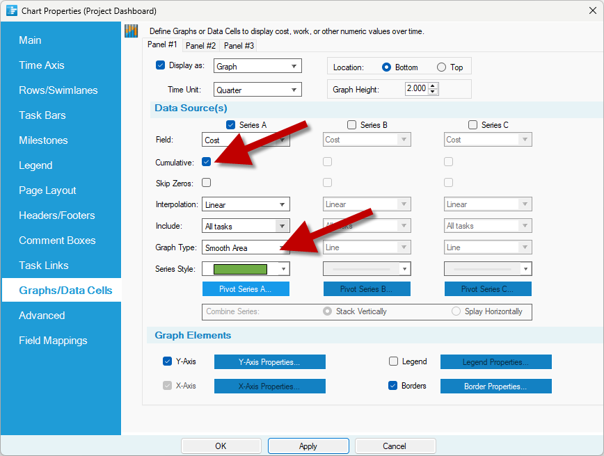
You can make a number of changes to the graph in your dashboard. For example, let's say that we want to switch from a column graph to an area graph and have the costs display cumulatively instead of quarterly. To do that, return to Home > Chart Properties > Graphs/Data Cells. Check the Cumulative box, and change the Graph Type to Smooth Area:
-
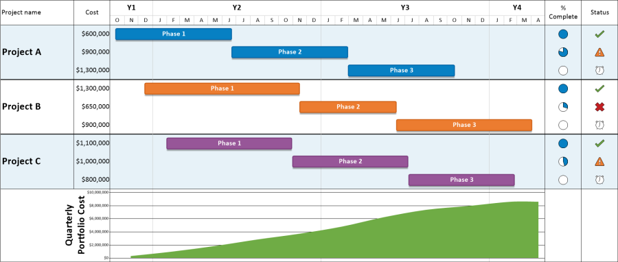
Click OK, and OnePager will update the graph in your project dashboard:
-
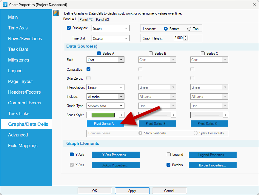
OnePager also allows you to slice and dice the graphs in your dashboard for a better breakdown of project finances. For example, you might want to see how much each project is contributing to the overall portfolio budget over time. To do this, go to Home > Chart Properties > Graphs/Data Cells again, and click on the Pivot Series button:
-
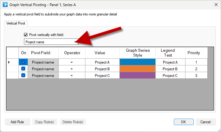
Change the graph to Pivot Vertically based on the Project Name and assign a unique color to each project in your portfolio:
-
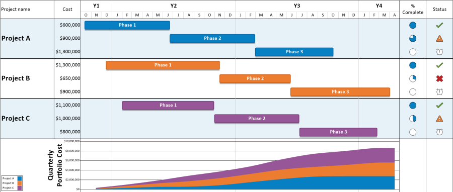
Click OK one more time, and OnePager will pivot your graph to show the contributions of each project in the dashboard to the overall portfolio cost:
OnePager gives you endless possibilities for creating project dashboards. You can:
- Dashboard one or multiple projects at once
- Include columns of text or symbols that include key project metrics
- Add a graph to track financial data over time
- Group, sort, and color-code by and field in your project plan
- Track versions to your dashboard as your project changes over time
- Add comments and other annotations to clarify important parts of the project
To learn more about how to make a project dashboard in OnePager and for more project plan examples, read some of our other how-to pages. Or get started today by downloading a free trial.
15-DayFree Trial
Steps demonstrated in this article require use of OnePager's optional graphs and data cells feature, which is purchased separately from a standard license. All trial licenses receive complimentary access to graphs and data cells for fifteen days. Some sequences pertaining to unrelated features have been shortened for brevity.